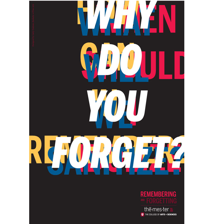
IU BFA student Carly Graham explored the theme of "Remembering and Forgetting." An interview with her is below.
What was the inspiration behind your work?
Carly: Before we began working on this project, a small group of professors came into our class to discuss the theme of remembering and forgetting. This discussion was extremely inspiring to me. The group discussed varying viewpoints on the theme and really gave a taste of what this semester would be like. Listening to these experts speak on what memory means to them made me think about what interests me within the topic.
Can you tell us about your design process?
Carly: My process came mainly in the form of writing down concepts and words that reminded me of memory. Usually when I create work, I do a lot of sketching. For this project, my sketching first came in the form of writing. The words that most intrigued me in the theme of remembering and forgetting were: “sanitization” “remembrance” and “idolize”. I then moved on to the computer and began playing with composition and color. I decided on primary colors, as the questions represented in my project represent the components on the topic of memory in the same way the primary colors are the components of all colors in the subtractive color spectrum.
What was the biggest challenge you had to overcome?
Carly: The biggest challenge of this project was taking such a huge project and distilling it in a concise poster. I decided to do this through text because in this topic, specific words made me think and wonder about the topic more than anything else.
What's your favorite part of your poster?
Carly: My favorite part of my poster is the moving version of my poster. I think the movement created by the motion of my poster encompasses the overwhelming and all-pervasive ideas of memory that my piece is trying to express.
Did your vision change throughout the design process?
Carly: My idea changed greatly throughout the process. My first idea for the poster was to recreate famous history paintings in a more realistic ways, with more gore and better representation than the class, clean, and white representations of history that is seen in paintings like Oath of the Horatii or Washington Crossing the Delaware. After I decided against that, I played with using images of Japanese internment as that is an important part of history that is often forgotten. In these iterations, I used a good amount of text. Finally, I took the textual ideas from my last idea and focused on creating a design solely based on text. I took inspiration from Bradbury Thomas and after many iterations, reached my final design.


 The College of Arts