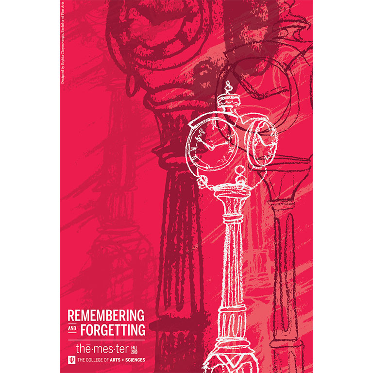
IU BFA student Sophia Chryssovergis explored the theme of "Remembering and Forgetting." An interview with her is below.
What was the inspiration behind your work?
Sophia: The inspiration behind my work was trying to conceptualize a visual or tangible representation of memory. As we know it, memory, remembering, and forgetting is invisible - it all happens inside our brains where we can't see it. My goal with this poster was to figure out how to visualize these processes. My thought process was that usually when we're remembering something, it's a hazy version of the original. We can never really remember something quite as clearly as we do when it first happens. I took that idea of haziness and represented it with a smudge, or smudged imagery. In terms of subject matter, I chose an IU landmark that I thought everyone could relate to - the infamous red clocks. There are three on campus, so the idea was that anyone who looked at the poster could be remembering any of the three clocks. Additionally, time plays a significant role in the processes of remembering and forgetting, so I thought choosing the clock would speak to the passage of time that is inevitably connected to memory. On the poster, as the clocks move further in the background, they lose more detail and become more smudged. This was my way of representing how memories become hazier the more we forget.
Can you tell us about your design process?
Sophia: To create my poster, I first had to come up with an idea. This came after long hours spent searching for inspiration on Pinterest and Google. I was first inspired by Impressionistic style paintings because their subjects were all of hazy, indistinct forms of objects or landscapes that made me think of what it might be to look at a physical memory. From there, I honed in on the idea of the smudge and decided I wanted to execute my poster - or at least the imagery of the poster - with charcoal. It's a very malleable material that smudges easily, which was perfect for my idea. My first draft was just a vectorized version of a charcoal drawing I did of the red clock, with some smudges in the background. I ended up not liking the composition, so I brainstormed some more, which is when I thought of the concept of multiple clocks representing the process of memory though their degradation over time. My previous version was black and white, which I didn't think would draw much attention, so I decided to add in some of the IU brand colors to liven it up and tie it back to IU. This version went though many critiques, and subsequently, many iterations. It started off as a purely digital design - I even did the linework in Illustrator. However, I received feedback that it strayed from my initial concept of the smudge. So, I executed the same composition but with multiple hand-drawn, charcoal clocks. I drew multiple versions of the same clock, some with many details, some with few details, and some that were very smudged, in order to execute my concept. This is how I landed on the final composition.
What was the biggest challenge you had to overcome?
Sophia: I think the biggest challenge throughout this process was figuring out how to make my concept - which was somewhat abstract and not very literal - come across in my design. I even struggled to put my concept into words at times because I wasn't necessarily trying to show a specific image or subject, but rather I was trying to illustrate a cognitive process that is tied to many different emotions. This was difficult to put onto paper. It was really about finessing my illustrations to clarify that the clocks were losing detail and becoming hazier over time, which would hopefully evoke the feeling of memory like it did for me. I think everyone has their own way of processing and thinking about memory, so this project was really about figuring out how to create a universal image of memory that anyone could relate to or understand when they looked at it.
What's your favorite part of your poster?
Sophia: My favorite part of my poster is definitely the line drawings of the clock. I used a technique called blind contour line drawing, which is when you draw something without picking up your pencil and without looking at your paper. I thought the fluidity of the lines would speak to the fluidity of memory. I'm happy with how my drawings turned out, and I'm glad that the smudged drawings worked out. I had to vectorize the drawings so that I could resize them digitally, and I was worried that I would lose all the definition of the smudges. However, it ended up working out pretty well. By the end, I probably drew around 15 different clocks to make sure I got the best results, and I'm pleased with the final composition.
Did your vision change throughout the design process?
Sophia: My vision changed the slightest bit. Instead of just illustrating one smudged clock, I decided to illustrate multiple clocks that lost definition and became more smudged as they moved to the background because I thought it was a better representation of the processes of remembering and forgetting. I also think the idea of multiple images moving back in space alludes to time, which is an important aspect of memory I wanted to highlight. My original composition was pretty static, so I just amped up my idea and composition a bit to make it more dynamic.


 The College of Arts